The Grid item positions its children in a grid. 更多...
| Since: | Qt 4.7 |
| 继承: | Item |
The Grid item positions its child items so that they are aligned in a grid and are not overlapping.
The grid positioner calculates a grid of rectangular cells of sufficient size to hold all items, placing the items in the cells, from left to right and top to bottom. Each item is positioned in the top-left corner of its cell with position (0, 0).
A Grid defaults to four columns, and as many rows as are necessary to fit all child items. The number of rows and columns can be constrained by setting the rows and columns 特性。
Spacing can be added between child items by setting the spacing property. The amount of spacing applied will be the same in the horizontal and vertical directions.
见 Using QML Positioner and Repeater Items for more details about this item and other related items.
The following example demonstrates this.
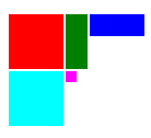
import QtQuick 1.0
Grid {
    columns: 3
    spacing: 2
    Rectangle { color: "red"; width: 50; height: 50 }
    Rectangle { color: "green"; width: 20; height: 50 }
    Rectangle { color: "blue"; width: 50; height: 20 }
    Rectangle { color: "cyan"; width: 50; height: 50 }
    Rectangle { color: "magenta"; width: 10; height: 10 }
}
Transitions can be used to animate items that are added to, moved within, or removed from a Grid item. The add and move properties can be set to the transitions that will be applied when items are added to, removed from, or re-positioned within a Grid item.
Note that the positioner assumes that the x and y positions of its children will not change. If you manually change the x or y properties in script, bind the x or y properties, use anchors on a child of a positioner, or have the width or height of a child depend on the position of a child, then the positioner may exhibit strange behaviour. If you need to perform any of these actions, consider positioning the items without the use of a Grid.
Items with a width or height of 0 will not be positioned.
另请参阅 Flow , Row , Column ,和 Positioners example .
|
add : Transition |
This property holds the transition to be applied when adding an item to the positioner. The transition will only be applied to the added item(s). Positioner transitions will only affect the position (x, y) of items.
For a positioner, adding an item can mean that either the object has been created or reparented, and thus is now a child or the positioner, or that the object has had its opacity increased from zero, and thus is now visible.
另请参阅 move .
This property holds the number of columns in the grid. The default number of columns is 4.
If the grid does not have enough items to fill the specified number of columns, some columns will be of zero width.
This property holds the flow of the layout.
Possible values are:
This property holds the layout direction of the layout.
Possible values are:
When using the attached property
LayoutMirroring::enabled
for locale layouts, the visual layout direction of the grid positioner will be mirrored. However, the property
layoutDirection
will remain unchanged. You can use the property
LayoutMirroring::enabled
to determine whether the direction has been mirrored.
This QML property was introduced in QtQuick 1.1.
另请参阅 Flow::layoutDirection , Row::layoutDirection , Layout directions example ,和 LayoutMirroring .
|
move : Transition |
This property holds the transition to be applied when moving an item within the positioner. Positioner transitions will only affect the position (x, y) of items.
This transition can be performed when other items are added or removed from the positioner, or when items resize themselves.
Grid {
    move: Transition {
        NumberAnimation {
            properties: "x,y"
            ease: "easeOutBounce"
        }
    }
}
另请参阅 add and Positioners example .
This property holds the number of rows in the grid.
If the grid does not have enough items to fill the specified number of rows, some rows will be of zero width.
The spacing is the amount in pixels left empty between adjacent items. The default spacing is 0.
The below example places a Grid containing a red, a blue and a green rectangle on a gray background. The area the grid positioner occupies is colored white. The positioner on the left has the no spacing (the default), and the positioner on the right has a spacing of 6.