Views are containers for collections of items. They are feature-rich and can be customizable to meet style or behavior requirements.
A set of standard views are provided in the basic set of Qt Quick graphical elements:
Unlike other views, WebView is not a fully-featured view item, and needs to be combined with a Flickable item to create a view that performs like a Web browser.
These elements have properties and behaviors exclusive to each element. Visit their respective documentation for more information.
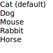
Views display models onto the screen. A model could be a simple list of integer 或 C++ model .
To assign a model to a view, bind the view's
model
property to a model.
ListModel {
    id: petlist
    ListElement { type: "Cat" }
    ListElement { type: "Dog" }
    ListElement { type: "Mouse" }
    ListElement { type: "Rabbit" }
    ListElement { type: "Horse" }
}
ListView {
    id: view
    anchors.fill: parent
    model: petlist
    delegate: petdelegate
}
更多信息,请翻阅 QML Data Models article.
Views need a
delegate
to visually represent an item in a list. A view will visualize each item list according to the template defined by the delegate. Items in a model are accessible through the
index
property as well as the item's properties.
Component {
    id: petdelegate
    Text {
        id: label
        font.pixelSize: 24
        text: if (index == 0)
            label.text = type + " (default)"
        else
            text: type
    }
}

Views allow visual customization through
decoration
properties such as the
header
,
footer
,和
section
properties. By binding an object, usually another visual object, to these properties, the views are decoratable. A footer may include a
Rectangle
element showcasing borders or a header that displays a logo on top of the list.
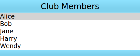
Suppose that a specific club wants to decorate its members list with its brand colors. A member list is in a
model
和
delegate
will display the model's content.
ListModel {
    id: nameModel
    ListElement { name: "Alice" }
    ListElement { name: "Bob" }
    ListElement { name: "Jane" }
    ListElement { name: "Harry" }
    ListElement { name: "Wendy" }
}
Component {
    id: nameDelegate
    Text {
        text: name;
        font.pixelSize: 24
    }
}
The club may decorate the members list by binding visual objects to the
header
and
footer
properties. The visual object may be defined inline, in another file, or in a
Component
元素。
ListView {
    anchors.fill: parent
    clip: true
    model: nameModel
    delegate: nameDelegate
    header: bannercomponent
    footer: Rectangle {
        width: parent.width; height: 30;
        gradient: clubcolors
    }
    highlight: Rectangle {
        width: parent.width
        color: "lightgray"
    }
}
Component {     //instantiated when header is processed
    id: bannercomponent
    Rectangle {
        id: banner
        width: parent.width; height: 50
        gradient: clubcolors
        border {color: "#9EDDF2"; width: 2}
        Text {
            anchors.centerIn: parent
            text: "Club Members"
            font.pixelSize: 32
        }
    }
}
Gradient {
    id: clubcolors
    GradientStop { position: 0.0; color: "#8EE2FE"}
    GradientStop { position: 0.66; color: "#7ED2EE"}
}

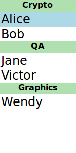
ListView contents may be grouped into sections , where related list items are labeled according to their sections. Further, the sections may be decorated with delegates .
A list may contain a list indicating people's names and the team on which team the person belongs.
ListModel {
    id: nameModel
    ListElement { name: "Alice"; team: "Crypto" }
    ListElement { name: "Bob"; team: "Crypto" }
    ListElement { name: "Jane"; team: "QA" }
    ListElement { name: "Victor"; team: "QA" }
    ListElement { name: "Wendy"; team: "Graphics" }
}
Component {
    id: nameDelegate
    Text {
        text: name;
        font.pixelSize: 24
        anchors.left: parent.left
        anchors.leftMargin: 2
    }
}
The
ListView
element has the
section
attached property
that can combine adjacent and related elements into a section. The section's
property
property is for selecting which list element property to use as sections. The
criteria
can dictate how the section names are displayed and the
delegate
is similar to the views'
delegate
特性。
ListView {
    anchors.fill: parent
    model: nameModel
    delegate: nameDelegate
    focus: true
    highlight: Rectangle {
        color: "lightblue"
        width: parent.width
    }
    section {
        property: "team"
        criteria: ViewSection.FullString
        delegate: Rectangle {
            color: "#b0dfb0"
            width: parent.width
            height: childrenRect.height + 4
            Text { anchors.horizontalCenter: parent.horizontalCenter
                font.pixelSize: 16
                font.bold: true
                text: section
            }
        }
    }
}
