The ListView item provides a list view of items provided by a model. 更多...
| Since: | Qt 4.7 |
| 继承: | Flickable |
A ListView displays data from models created from built-in QML elements like ListModel and XmlListModel , or custom model classes defined in C++ that inherit from QAbstractListModel .
A ListView 拥有 model , which defines the data to be displayed, and a delegate , which defines how the data should be displayed. Items in a ListView are laid out horizontally or vertically. List views are inherently flickable because ListView 继承自 Flickable .
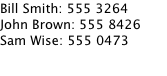
The following example shows the definition of a simple list model defined in a file called
ContactModel.qml
:
import QtQuick 1.0
ListModel {
    ListElement {
        name: "Bill Smith"
        number: "555 3264"
    }
    ListElement {
        name: "John Brown"
        number: "555 8426"
    }
    ListElement {
        name: "Sam Wise"
        number: "555 0473"
    }
}
Another component can display this model data in a ListView ,像这样:
import QtQuick 1.0
ListView {
    width: 180; height: 200
    model: ContactModel {}
    delegate: Text {
        text: name + ": " + number
    }
}
在这里,
ListView
创建
ContactModel
component for its model, and a
Text
element for its delegate. The view will create a new
Text
component for each item in the model. Notice the delegate is able to access the model's
名称
and
编号
data directly.
An improved list view is shown below. The delegate is visually improved and is moved into a separate
contactDelegate
组件。
Rectangle {
    width: 180; height: 200
    Component {
        id: contactDelegate
        Item {
            width: 180; height: 40
            Column {
                Text { text: '<b>Name:</b> ' + name }
                Text { text: '<b>Number:</b> ' + number }
            }
        }
    }
    ListView {
        anchors.fill: parent
        model: ContactModel {}
        delegate: contactDelegate
        highlight: Rectangle { color: "lightsteelblue"; radius: 5 }
        focus: true
    }
}
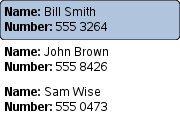
The currently selected item is highlighted with a blue
Rectangle
使用
highlight
property, and
focus
被设为
true
to enable keyboard navigation for the list view. The list view itself is a focus scope (see
the focus documentation page
了解更多细节)。
Delegates are instantiated as needed and may be destroyed at any time. State should never be stored in a delegate.
ListView
attaches a number of properties to the root item of the delegate, for example
ListView.isCurrentItem
. In the following example, the root delegate item can access this attached property directly as
ListView.isCurrentItem
, while the child
contactInfo
object must refer to this property as
wrapper.ListView.isCurrentItem
.
ListView {
    width: 180; height: 200
    Component {
        id: contactsDelegate
        Rectangle {
            id: wrapper
            width: 180
            height: contactInfo.height
            color: ListView.isCurrentItem ? "black" : "red"
            Text {
                id: contactInfo
                text: name + ": " + number
                color: wrapper.ListView.isCurrentItem ? "red" : "black"
            }
        }
    }
    model: ContactModel {}
    delegate: contactsDelegate
    focus: true
}
注意: Views do not enable clip automatically. If the view is not clipped by another item or the screen, it will be necessary to set clip: true in order to have the out of view items clipped nicely.
另请参阅 QML Data Models , GridView ,和 ListView examples .
This property determines whether delegates are retained outside the visible area of the view.
If this value is non-zero, the view keeps as many delegates instantiated as it can fit within the buffer specified. For example, if in a vertical view the delegate is 20 pixels high and
cacheBuffer
is set to 40, then up to 2 delegates above and 2 delegates below the visible area may be retained.
Note that cacheBuffer is not a pixel buffer - it only maintains additional instantiated delegates.
Setting this value can improve the smoothness of scrolling behavior at the expense of additional memory usage. It is not a substitute for creating efficient delegates; the fewer elements in a delegate, the faster a view can be scrolled.
This property holds the number of items in the view.
The
currentIndex
property holds the index of the current item, and
currentItem
holds the current item. Setting the currentIndex to -1 will clear the highlight and set
currentItem
to null.
若
highlightFollowsCurrentItem
is
true
, setting either of these properties will smoothly scroll the
ListView
so that the current item becomes visible.
Note that the position of the current item may only be approximate until it becomes visible in the view.
|
currentItem : Item |
The
currentIndex
property holds the index of the current item, and
currentItem
holds the current item. Setting the
currentIndex
to -1 will clear the highlight and set currentItem to null.
若
highlightFollowsCurrentItem
is
true
, setting either of these properties will smoothly scroll the
ListView
so that the current item becomes visible.
Note that the position of the current item may only be approximate until it becomes visible in the view.
This property holds the section that is currently at the beginning of the view.
|
delegate : Component |
The delegate provides a template defining each item instantiated by the view. The index is exposed as an accessible
index
property. Properties of the model are also available depending upon the type of
Data Model
.
The number of elements in the delegate has a direct effect on the flicking performance of the view. If at all possible, place functionality that is not needed for the normal display of the delegate in a Loader which can load additional elements when needed.
The ListView will lay out the items based on the size of the root item in the delegate.
It is recommended that the delagate's size be a whole number to avoid sub-pixel alignment of items.
注意: Delegates are instantiated as needed and may be destroyed at any time. State should never be stored in a delegate.
|
footer : Component |
This property holds the component to use as the footer.
An instance of the footer component is created for each view. The footer is positioned at the end of the view, after any items.
另请参阅 header .
|
header : Component |
This property holds the component to use as the header.
An instance of the header component is created for each view. The header is positioned at the beginning of the view, before any items.
另请参阅 footer .
|
highlight : Component |
This property holds the component to use as the highlight.
An instance of the highlight component is created for each list. The geometry of the resulting component instance is managed by the list so as to stay with the current item, unless the highlightFollowsCurrentItem property is false.
另请参阅 highlightItem , highlightFollowsCurrentItem ,和 ListView examples .
This property holds whether the highlight is managed by the view.
If this property is true (the default value), the highlight is moved smoothly to follow the current item. Otherwise, the highlight is not moved by the view, and any movement must be implemented by the highlight.
Here is a highlight with its motion defined by a SpringAnimation item:
Component {
    id: highlight
    Rectangle {
        width: 180; height: 40
        color: "lightsteelblue"; radius: 5
        y: list.currentItem.y
        Behavior on y {
            SpringAnimation {
                spring: 3
                damping: 0.2
            }
        }
    }
}
ListView {
    id: list
    width: 180; height: 200
    model: ContactModel {}
    delegate: Text { text: name }
    highlight: highlight
    highlightFollowsCurrentItem: false
    focus: true
}
Note that the highlight animation also affects the way that the view is scrolled. This is because the view moves to maintain the highlight within the preferred highlight range (or visible viewport).
另请参阅 highlight and highlightMoveSpeed .
|
highlightItem : Item |
This holds the highlight item created from the highlight 组件。
The
highlightItem
is managed by the view unless
highlightFollowsCurrentItem
被设为 false。
另请参阅 highlight and highlightFollowsCurrentItem .
These properties hold the move and resize animation speed of the highlight delegate.
highlightFollowsCurrentItem must be true for these properties to have effect.
The default value for the speed properties is 400 pixels/second. The default value for the duration properties is -1, i.e. the highlight will take as much time as necessary to move at the set speed.
These properties have the same characteristics as a SmoothedAnimation .
另请参阅 highlightFollowsCurrentItem .
These properties define the preferred range of the highlight (for the current item) within the view. The
preferredHighlightBegin
value must be less than the
preferredHighlightEnd
值。
These properties affect the position of the current item when the list is scrolled. For example, if the currently selected item should stay in the middle of the list when the view is scrolled, set the
preferredHighlightBegin
and
preferredHighlightEnd
values to the top and bottom coordinates of where the middle item would be. If the
currentItem
is changed programmatically, the list will automatically scroll so that the current item is in the middle of the view. Furthermore, the behavior of the current item index will occur whether or not a highlight exists.
Valid values for
highlightRangeMode
是:
These properties hold the move and resize animation speed of the highlight delegate.
highlightFollowsCurrentItem must be true for these properties to have effect.
The default value for the speed properties is 400 pixels/second. The default value for the duration properties is -1, i.e. the highlight will take as much time as necessary to move at the set speed.
These properties have the same characteristics as a SmoothedAnimation .
另请参阅 highlightFollowsCurrentItem .
This property holds whether the list wraps key navigation.
If this is true, key navigation that would move the current item selection past the end of the list instead wraps around and moves the selection to the start of the list, and vice-versa.
By default, key navigation is not wrapped.
This property holds the layout direction of the horizontal list.
可能的值:
When using the attached property
LayoutMirroring::enabled
for locale layouts, the layout direction of the horizontal list will be mirrored. However, the actual property
layoutDirection
will remain unchanged. You can use the property
LayoutMirroring::enabled
to determine whether the direction has been mirrored.
另请参阅 LayoutMirroring .
|
model : model |
This property holds the model providing data for the list.
The model provides the set of data that is used to create the items in the view. Models can be created directly in QML using ListModel , XmlListModel or VisualItemModel , or provided by C++ model classes. If a C++ model class is used, it must be a subclass of QAbstractItemModel or a simple list.
另请参阅 数据模型 .
This property holds the orientation of the list.
可能的值:
Horizontal orientation:

|
|
Vertical orientation:
|
These properties define the preferred range of the highlight (for the current item) within the view. The
preferredHighlightBegin
value must be less than the
preferredHighlightEnd
值。
These properties affect the position of the current item when the list is scrolled. For example, if the currently selected item should stay in the middle of the list when the view is scrolled, set the
preferredHighlightBegin
and
preferredHighlightEnd
values to the top and bottom coordinates of where the middle item would be. If the
currentItem
is changed programmatically, the list will automatically scroll so that the current item is in the middle of the view. Furthermore, the behavior of the current item index will occur whether or not a highlight exists.
Valid values for
highlightRangeMode
是:
|
section group |
|---|
|
section.delegate : Component |
These properties hold the expression to be evaluated for the section attached property.
The section attached property enables a ListView to be visually separated into different parts. These properties determine how sections are created.
section.property
holds the name of the property that is the basis of each section.
section.criteria
holds the criteria for forming each section based on
section.property
. This value can be one of:
section.property
值。
section.property
value (for example, 'A', 'B', 'C' sections, etc. for an address book)
section.delegate
holds the delegate component for each section.
Each item in the list has attached properties named
ListView.section
,
ListView.previousSection
and
ListView.nextSection
. These may be used to place a section header for related items.
For example, here is a
ListView
that displays a list of animals, separated into sections. Each item in the
ListView
is placed in a different section depending on the "size" property of the model item. The
sectionHeading
delegate component provides the light blue bar that marks the beginning of each section.
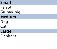
注意: Adding sections to a ListView does not automatically re-order the list items by the section criteria. If the model is not ordered by section, then it is possible that the sections created will not be unique; each boundary between differing sections will result in a section header being created even if that section exists elsewhere.
另请参阅 ListView examples .
This property determines how the view scrolling will settle following a drag or flick. The possible values are:
snapMode
does not affect the
currentIndex
. To update the
currentIndex
as the list is moved, set
highlightRangeMode
to
ListView.StrictlyEnforceRange
.
另请参阅 highlightRangeMode .
This property holds the spacing between items.
默认值为 0。
This attached property holds whether the delegate may be destroyed.
It is attached to each instance of the delegate.
It is sometimes necessary to delay the destruction of an item until an animation completes.
The example delegate below ensures that the animation completes before the item is removed from the list.
Component {
    id: delegate
    Item {
        ListView.onRemove: SequentialAnimation {
            PropertyAction { target: wrapper; property: "ListView.delayRemove"; value: true }
            NumberAnimation { target: wrapper; property: "scale"; to: 0; duration: 250; easing.type: Easing.InOutQuad }
            PropertyAction { target: wrapper; property: "ListView.delayRemove"; value: false }
        }
    }
}
This attached property is true if this delegate is the current item; otherwise false.
It is attached to each instance of the delegate.
This property may be used to adjust the appearance of the current item, for example:
ListView {
    width: 180; height: 200
    Component {
        id: contactsDelegate
        Rectangle {
            id: wrapper
            width: 180
            height: contactInfo.height
            color: ListView.isCurrentItem ? "black" : "red"
            Text {
                id: contactInfo
                text: name + ": " + number
                color: wrapper.ListView.isCurrentItem ? "red" : "black"
            }
        }
    }
    model: ContactModel {}
    delegate: contactsDelegate
    focus: true
}
This attached property holds the section of the next element.
It is attached to each instance of the delegate.
The section is evaluated using the section 特性。
This attached property holds the section of the previous element.
It is attached to each instance of the delegate.
The section is evaluated using the section 特性。
This attached property holds the section of this element.
It is attached to each instance of the delegate.
The section is evaluated using the section 特性。
|
ListView.view : ListView |
This attached property holds the view that manages this delegate instance.
It is attached to each instance of the delegate.
This attached handler is called immediately after an item is added to the view.
This attached handler is called immediately before an item is removed from the view.
Decrements the current index. The current index will wrap if keyNavigationWraps is true and it is currently at the beginning. This method has no effect if the count is zero.
注意 : methods should only be called after the Component has completed.
Increments the current index. The current index will wrap if keyNavigationWraps is true and it is currently at the end. This method has no effect if the count is zero.
注意 : methods should only be called after the Component has completed.
|
int indexAt ( int x , int y ) |
Returns the index of the visible item containing the point x , y in content coordinates. If there is no item at the point specified, or the item is not visible -1 is returned.
If the item is outside the visible area, -1 is returned, regardless of whether an item will exist at that point when scrolled into view.
注意 : methods should only be called after the Component has completed.
Positions the view at the beginning or end, taking into account any header or footer.
It is not recommended to use contentX or contentY to position the view at a particular index. This is unreliable since removing items from the start of the list does not cause all other items to be repositioned, and because the actual start of the view can vary based on the size of the delegates.
注意 : methods should only be called after the Component has completed. To position the view at startup, this method should be called by Component.onCompleted. For example, to position the view at the end on startup:
Component.onCompleted: positionViewAtEnd()
This QML method was introduced in QtQuick 1.1.
Positions the view such that the index is at the position specified by mode :
If positioning the view at index would cause empty space to be displayed at the beginning or end of the view, the view will be positioned at the boundary.
It is not recommended to use
contentX
or
contentY
to position the view at a particular index. This is unreliable since removing items from the start of the list does not cause all other items to be repositioned, and because the actual start of the view can vary based on the size of the delegates. The correct way to bring an item into view is with
positionViewAtIndex
.
注意 : methods should only be called after the Component has completed. To position the view at startup, this method should be called by Component.onCompleted. For example, to position the view at the end:
Component.onCompleted: positionViewAtIndex(count - 1, ListView.Beginning)