The QPushButton 小部件提供命令按鈕。 更多...
| 頭: | #include <QPushButton> |
| 繼承: | QAbstractButton |
| 繼承者: | QCommandLinkButton |
| QPushButton (QWidget * parent = 0) | |
| QPushButton (const QString & text , QWidget * parent = 0) | |
| QPushButton (const QIcon & icon , const QString & text , QWidget * parent = 0) | |
| ~QPushButton () | |
| bool | autoDefault () const |
| bool | isDefault () const |
| bool | isFlat () const |
| QMenu * | menu () const |
| void | setAutoDefault (bool) |
| void | setDefault (bool) |
| void | setFlat (bool) |
| void | setMenu (QMenu * menu ) |
| virtual QSize | minimumSizeHint () const |
| virtual QSize | sizeHint () const |
| void | showMenu () |
| void | initStyleOption (QStyleOptionButton * option ) const |
| virtual bool | event (QEvent * e ) |
| virtual void | focusInEvent (QFocusEvent * e ) |
| virtual void | focusOutEvent (QFocusEvent * e ) |
| virtual bool | hitButton (const QPoint & pos ) const |
| virtual void | keyPressEvent (QKeyEvent * e ) |
| virtual void | paintEvent (QPaintEvent *) |
The QPushButton 小部件提供命令按鈕。
按鈕 (或命令按鈕) 或許是任何圖形用戶界麵中最常用的 Widget。按下 (點擊) 按鈕以命令計算機履行某些動作或迴答問題。典型按鈕有 OK、Apply、Cancel、Close、Yes、No 及 Help。
命令按鈕為矩形且通常顯示描述其動作的文本標簽。可以通過在文本首選字符前麵加上 & 和號來指定快捷鍵。例如:
QPushButton *button = new QPushButton("&Download", this);
在此範例中快捷方式是 Alt+D 。見 QShortcut 文檔編製瞭解細節 (要顯示實際和號,使用 &&)。
按鈕顯示正文標簽和可選小圖標。這些可以使用構造函數設置和以後更改使用 setText () 和 setIcon (). If the button is disabled the appearance of the text and icon will be manipulated with respect to the GUI style to make the button look "disabled".
按鈕發射信號 clicked () when it is activated by the mouse, the Spacebar or by a keyboard shortcut. Connect to this signal to perform the button's action. Push buttons also provide less commonly used signals, for example, pressed () 和 released ().
Command buttons in dialogs are by default auto-default buttons, i.e. they become the default push button automatically when they receive the keyboard input focus. A default button is a push button that is activated when the user presses the Enter or Return key in a dialog. You can change this with setAutoDefault ()。注意,自動默認按鈕會預留一點額外空間,這是繪製默認按鈕指示器所必需的。若不希望此空間圍繞在按鈕周圍,調用 setAutoDefault (false).
由於如此重要,過去十年間按鈕 Widget 已發展適應許多變化。微軟風格指南現在展示約 10 種不同 Windows 按鈕狀態,文本還隱含一打以上狀態當考慮所有特徵組閤時。
最重要的模式 (或狀態):
作為一般規則,使用按鈕當用戶點擊應用程序 (或對話框窗口) 履行動作時 (如:應用、取消、關閉和幫助) and 當 Widget 被假定擁有帶文本標簽的寬矩形形狀時。通常,更改窗口狀態而不是履行動作的較小方形按鈕 (如:右上角按鈕在 QFileDialog ) 不是命令按鈕,而是工具按鈕。Qt 提供特殊類 ( QToolButton ) 為這些按鈕。
若需要觸發行為 (見 setCheckable ()) 或像滾動條中箭頭當被按下時自動重復激活信號的按鈕 (見 setAutoRepeat ()),命令按鈕可能不是您想要的。如有疑問,使用工具按鈕。
命令按鈕的變體是菜單按鈕。它們僅僅提供一個命令而是多個命令,由於點擊它們時會彈齣選項菜單。使用方法 setMenu () 關聯彈齣菜單與按鈕。
其它種類的按鈕:選項按鈕 (見 QRadioButton ) 和復選框 (見 QCheckBox ).

|
A push button shown in the
Macintosh widget style
.
Note that when a button's width becomes smaller than 50 or its height becomes smaller than 30, the button's corners are changed from round to square. Use the setMinimumSize () 函數能阻止此行為。 |

|
A push button shown in the Windows XP widget style . |

|
A push button shown in the Plastique widget style . |
在 Qt 中, QAbstractButton 基類提供大多數模式和其它 API,而 QPushButton 提供 GUI 邏輯。見 QAbstractButton 瞭解有關 API 的更多信息。
另請參閱 QToolButton , QRadioButton , QCheckBox ,和 GUI 設計手冊:按鈕 .
This property holds whether the push button is an auto default button.
若把此特性設為 true,那麼按鈕是自動默認按鈕。
In some GUI styles a default button is drawn with an extra frame around it, up to 3 pixels or more. Qt automatically keeps this space free around auto-default buttons, i.e. auto-default buttons may have a slightly larger size hint.
此特性默認為 true 若按鈕擁有 QDialog 父級;否則默認為 false。
見 default 特性瞭解細節對於如何 default 和自動交互默認。
訪問函數:
| bool | autoDefault () const |
| void | setAutoDefault (bool) |
This property holds whether the push button is the default button.
默認和自動默認按鈕決定發生什麼,當用戶在對話框中按下 Enter 鍵時。
將此特性設為 true 的按鈕 (即:對話框的 default 按鈕),會被自動按下當用戶按下 Enter 鍵時,有一例外:若 autoDefault 按鈕目前有聚焦, autoDefault 按鈕被按下。當對話框有 autoDefault 按鈕但沒有默認按鈕,按下 Enter 鍵將按下 autoDefault 按鈕 (目前有聚焦),或者若沒有按鈕有聚焦,按下下一 autoDefault 聚焦鏈按鈕。
在對話框中,一次隻可以有一個按鈕是默認按鈕。那麼,此按鈕將顯示額外框架 (從屬 GUI 風格)。
默認按鈕行為僅在對話框提供。始終可以通過按下鍵盤空格鍵點擊按鈕,當按鈕有聚焦時。
If the default property is set to false on the current default button while the dialog is visible, a new default will automatically be assigned the next time a pushbutton in the dialog receives focus.
此特性默認為 false。
訪問函數:
| bool | isDefault () const |
| void | setDefault (bool) |
This property holds whether the button border is raised.
此特性默認為 false。若有設置此特性,大多數風格不會繪製按鈕背景,除非按鈕被按下。 setAutoFillBackground () 可以用於確保背景被填充使用 QPalette::Button 筆刷。
訪問函數:
| bool | isFlat () const |
| void | setFlat (bool) |
構造按鈕沒有文本和 parent .
構造按鈕采用父級 parent 和文本 text .
構造按鈕采用 icon 和 text ,和 parent .
注意:也可以傳遞 QPixmap 對象作為圖標 (感謝由 C++ 提供的隱式類型轉換)。
銷毀按鈕。
[virtual protected]
bool
QPushButton::
event
(
QEvent
*
e
)
重實現自 QObject::event ().
[virtual protected]
void
QPushButton::
focusInEvent
(
QFocusEvent
*
e
)
重實現自 QWidget::focusInEvent ().
[virtual protected]
void
QPushButton::
focusOutEvent
(
QFocusEvent
*
e
)
重實現自 QWidget::focusOutEvent ().
[virtual protected]
bool
QPushButton::
hitButton
(const
QPoint
&
pos
) const
重實現自 QAbstractButton::hitButton ().
[protected]
void
QPushButton::
initStyleOption
(
QStyleOptionButton
*
option
) const
初始化 option 采用值來自此 QPushButton 。此方法對子類是有用的,當需要 QStyleOptionButton ,但不希望自己填充所有信息。
另請參閱 QStyleOption::initFrom ().
[virtual protected]
void
QPushButton::
keyPressEvent
(
QKeyEvent
*
e
)
重實現自 QWidget::keyPressEvent ().
返迴按鈕關聯的彈齣菜單,或 0 若未設置彈齣菜單。
另請參閱 setMenu ().
[虛擬]
QSize
QPushButton::
minimumSizeHint
() const
重實現自 QWidget::minimumSizeHint ().
[virtual protected]
void
QPushButton::
paintEvent
(
QPaintEvent
*)
重實現自 QWidget::paintEvent ().
關聯彈齣菜單 menu 與此按鈕。這把按鈕變成菜單按鈕,在某些風格中按鈕文本右側會産生小三角形。
菜單的所有權 not 被傳輸給按鈕。
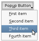
|
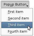
|
Push buttons with popup menus shown in the Plastique widget style (left) and Cleanlooks widget style (right). |
另請參閱 menu ().
[slot]
void
QPushButton::
showMenu
()
展示 (彈齣) 關聯的彈齣菜單。若沒有這種菜單,此函數什麼都不做。此函數直到用戶關閉彈齣菜單後纔返迴。
[虛擬]
QSize
QPushButton::
sizeHint
() const
重實現自 QWidget::sizeHint ().